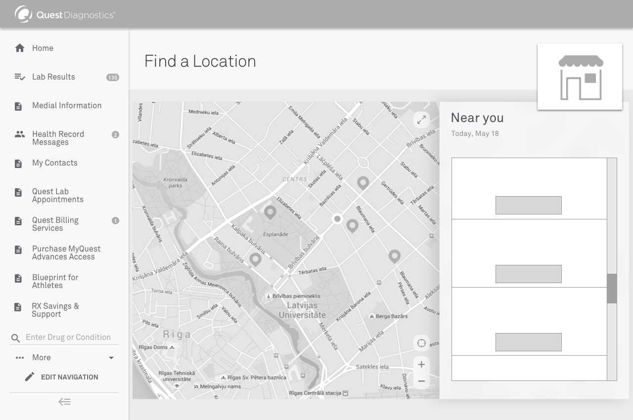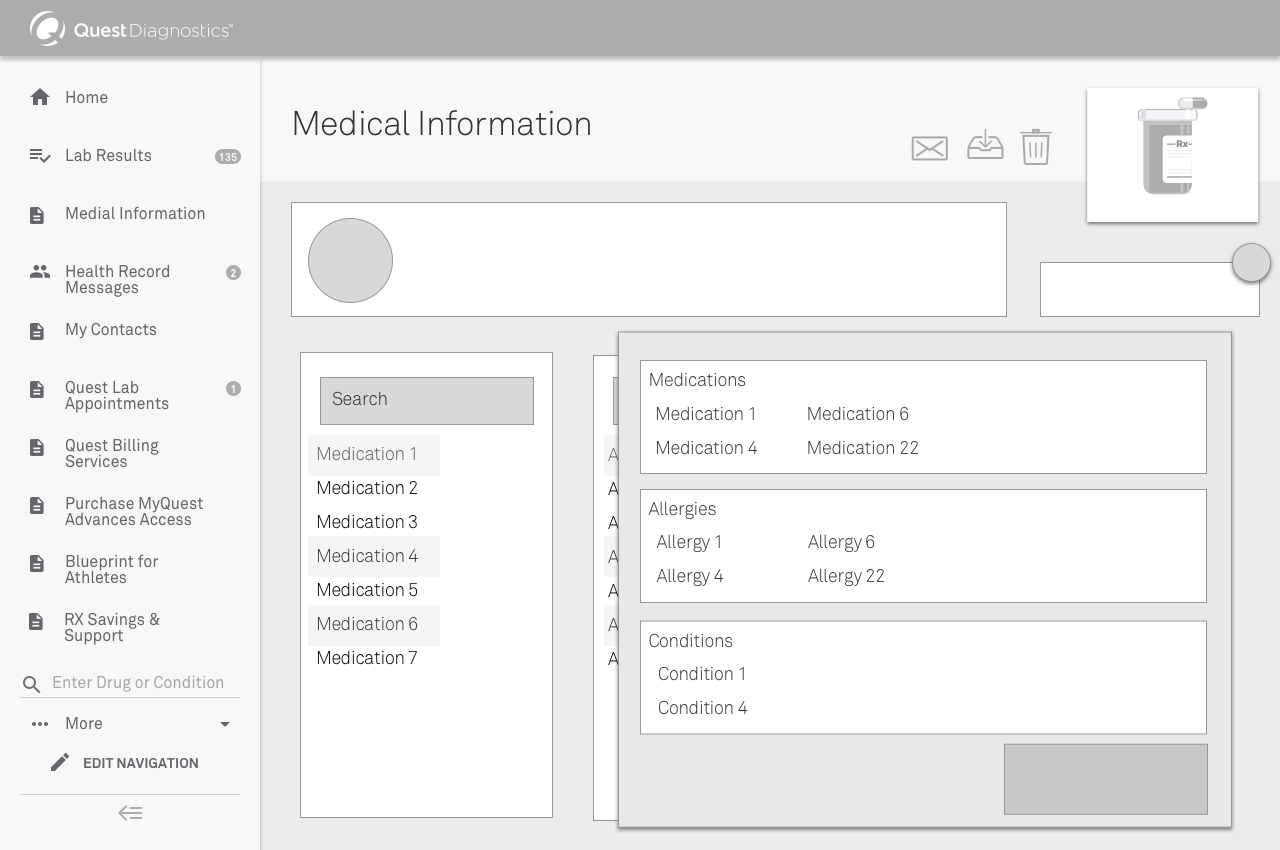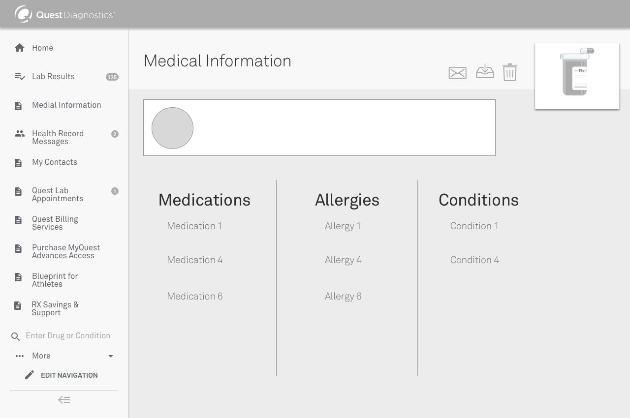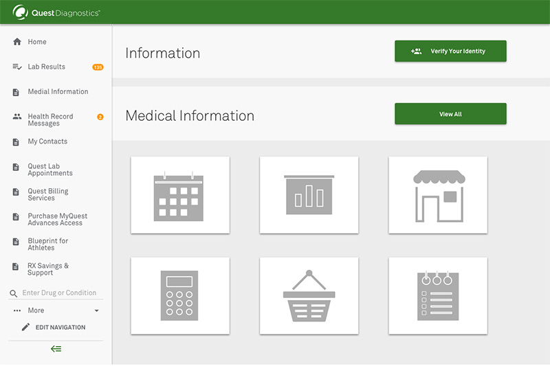
On this project I was given minimal requirements on creating a digital experience for patients, both new and returning, to have the ability to schedule appointments, find a testing location, and view testing results. This wireframe is set up to be the first step in an overall redesign. The idea of this redesign was to simplify a user’s journey across multiple websites and forms to find the information they need about getting blood drawn, and then how to act on what their next steps would look like.
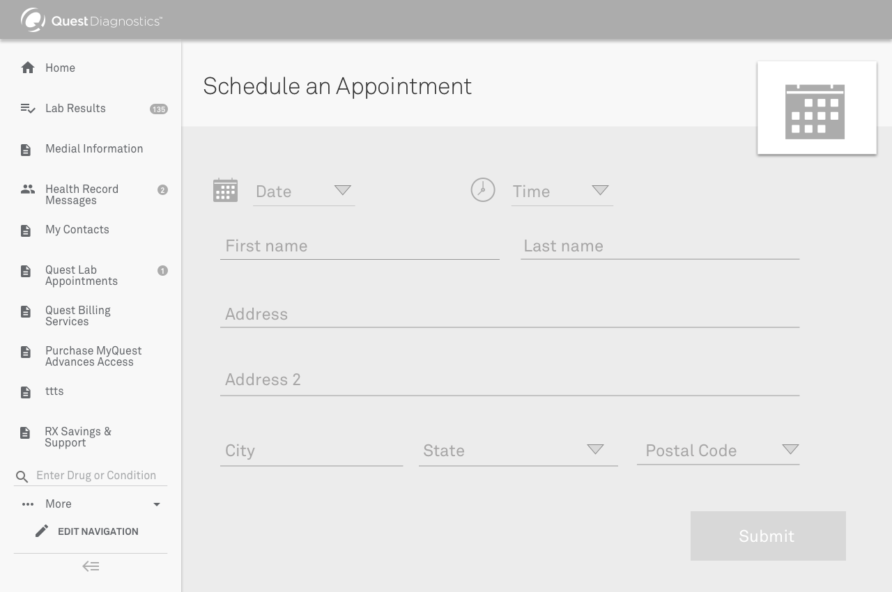
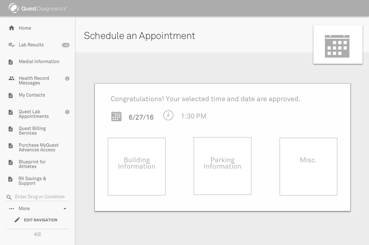
In this workflow, I am showing the initial screen the patient will visit, then the steps they will take to selected an available location and time. Through user testing, I was able to find the optimal flow for patients, choosing first a location near them, and then the available date and time.
These screens were designed based on user empathy and website traffic data, looking at interactions, bounce rate, and page exits.